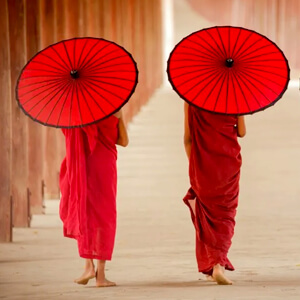
Color Wheel & Power of Colors

Color Wheel & Power of Colors
Colour of an object is not actually within the object itself. Rather, colour is in the light that shines, absorbs and reflect in different wave length. Light and colour are seen by the human eye because of two types of photoreceptor cell-rods and cones located in the retina of the eye. Rods are sensitive to light and dark cones are sensitive to red, green and blue light and responsible for colour version. These photoreceptors convey the colour of light to our brain. A colour wheel or colour circle is an abstract illustrative organization of colour around a circle that shows relationship between primary, secondary and tertiary colours. Some sources use the term colour wheel and colour circle interchangeably, however one term or the other may be accurate in certain field or certain version as mentioned above. The arrangement of color around the colour circle is often considered to be in correspondence with the wave length of light as opposed to hues, in accordance with the original color circle of Isaac Newton. Modern color circle includes the purple, however between red and violet. Color scientists and psychologist use the additive primaries red, green, blue and often refer to their arrangement around circle as a color as opposed to a colour wheel.

Effect & Powers of Colours - More than Meets the Eye

Power and Effects of Colors
Colours are so much more potent than we know. They are able to control emotions, build perceptions, and even change behaviors without our consciousness. Imagine stepping into a yellow-painted room. You can feel an immediate surge of energy or even happiness. That's the power of yellow-it is a color that symbolizes optimism and creativity. On the other hand, a deep blue room can be very soothing to the nerves and help one focus, which is why it's often used in offices or rooms for meditation. But the powers of colors do not stop here. They also influence decision-making. Fast food chains are well known to use red and yellow because these colours stimulate appetite and convey a sense of urgency - something that fast-food chains thrive on. Colors in fashion can make or break an outfit. A red dress might command attention and confidence, while a soft lavender blouse might give the impression of gentleness and sophistication. Colours have a psychological pull beyond aesthetics, which can evoke memories, inspire action, or create a sense of belonging. For example, sports teams rely heavily on their colours to foster loyalty and pride among fans. From branding and personal expression to mood and atmosphere, colors have that almost magical, intangible pull on how we perceive and respond to the world around us. So whether its a design, an outfit or even the cup your coffee in, remember - the colors don't just decorate they communicate.

Hue & Value of Colors

Hue, Saturation and Value of Colors
Value is defined as relative lightness or darkness of a color. It is an important part for a designer artist in the way that it defines from and creates spatial illusions. Contrast of value separates object in space while gradation of value suggests mass and contour of contiguous surface. Hue has also value. Hue is the term for the pure spectrum colors commonly referred to be the 'Colour names' red, orange, yellow, blue, green, voilet which appear in the circle or rainbow, theoretically result in black. Therefore pigment mixture is sometimes referred to as subtractive mixture. The colour wheel is the basic tool for combining colors. The first color diagram was designed by Sir Isaac Newton in 1666. The color wheel is designed so that virtually any color you pick from it will look good together. Over the years, many variations of the basic design have been made but the most common version is wheel of 12 Colors based on the RVB (or artistic) colour model. Traditionally, there are a number of color combination that are considered especially pleasing. These are called color harmonies or color chords and they consist of 2 or more color with a fixed relation in the colour wheel.

Primary, Secondary, Tertiary & Supplementary Colours

Primary, Secondary, Tertiary & Supplementary Colours
Colours are the foundation of design, art, and fashion, and understanding their relationships is key to mastering their use. At the heart of it all are Primary Colours - Red, Blue & Yellow - which serve as the building blocks for every other hue. When these mix in pairs, they create Secondary Colours like green, orange and purple, opening up new possibilities. The journey doesn't stop there. By blending primary and secondary colours, we get Tertiary Colours, such as teal, vermilion, and chartreuse, offering even more depth and nuance. Meanwhile, Supplementary Colours, or Complementary Hues, sit opposite each other on the colour wheel, creating vibrant contrasts when paired. This interplay of colours is the secret behind striking designs and harmonious palettes, whether in fashion, art or interiors.
 
  • Primary Colours - Colors at their basic essence; those colours that cannot be created by mixing others.
  • Secondary Colours - Theses are acheived by a mixture of 2 Primary Colours.
  • Tertiary Colours - These are acheived by a mixture of Primary and Secondary hues.
  • Supplementary Colours - These are located opposite to each other on a Color Wheel.
Tints, Tones & Shades of a Color - The Building Blocks of Colour
Tint, Tone and Shade are the unsung heroes of colour design, adding depth, dimension, and mood to every palette. A tint is created by adding white to a base colour, resulting in softer, lighter hues like pastel pink or baby blue. In contrast, a shade emerges when black is added, producing deeper, more dramatic versions like maroon or navy. A tone, however, strikes a balance by mixing grey with the base colour, creating sophisticated, muted variations that are neither too bright nor too dark. These three elements allow designers, artists, and stylists to manipulate colours, creating endless possibilities to match the desired emotion, theme, or style. Understanding these nuances is essential for anyone working with colour, as they transform simple hues into captivating stories.
These terms are often used incorrectly. Although they decide fairly simple color concepts.
 
  • Shades - If black is added, the darker version is called a shade. It contains no white or gray. Shade darkens the color, but the hue remains the same.
  • Tones - Tone of a colour is achieved if grey (equal amounts of black and white) is added is to pure colours. Adding grey to a color will make the intensity much duller.
  • Tints - If a color is made lighter by adding white, the result is called tint. Pastel colors are generally tinted colors. Tinted color remains the same color, but it is paler than the original.
Colour Harmony - Basic Techniques of Creating a Color Wheel
  • Complementary Color Scheme - Colour thar are opposite to each other on the color wheel are considered to be complimentary color [Eg: Red and Green]. The high contrast of complementary color create a vibrant look especially when used at full saturation it is really bad for text.
  • Analog Color Scheme - Analogous color scheme are color's that are next to each other on the color wheel. They usually match well and create comfortable design.
  • Triadic Color Scheme - A triadic color scheme uses colors are evenly spaced around the color wheel. Triadic schemes tend to be quite vibrant, even if you use pale of unsaturated version of your hues.
  • Split Complementory - The split complementary color scheme is a variation of the complementary color scheme. In addition to the base color it uses the 2 colors adjacent to its complimentory. The split complementary color scheme is often a good choices for brightness because it is difficult to mess up.
  • Rectangle (Tetradic) Color Scheme - The rectangle or tetradic color scheme uses 4 colors arranged into two complementry pair. The rich color scheme offers plenty of possibilities for varation.
  • Square Color Scheme - The square color scheme is similar to the rectangle but all four colors are spaced evenly around the color circle.
Colour Relationship - The Art of Harmonising Hues
Colour relationships are the foundation of design, blending hues in a way that creates visual harmony and balance. Just like people, colours have their own personalities and can work beautifully together or clash if not carefully paired. Understanding how colours interact - whether through complementary, analogous or triadic relationships - helps designers create more than just aesthetically pleasing compositions; it allows them to evoke specific moods and emotions. Whether you're crafting a fashion collection, designing a brand identity, or decorating a space, mastering colour relationships is key to ensuring that the final result feels intentional and cohesive. In the world of design, knowing how to make colours complement and contrast with one another is a skill that elevates every project.
Color relationship may be displayed as a color wheel or a color triangle.
  • The painter's color triangle consists of color we would often use in art class. The primary hue are red, blue and yellow.
  • The painter's color triangle is the set of colours used in the printing process. The primaries are magenta, cyan and yellow.
  • Nine-part harmonic triangle of Goethe begins with the painters primaries and the resulting tertiaries formed are dark neutrals.
Psychological Effects of Colours - How They Shape Our Emotions
Colours have this magical way of influencing our mood, thoughts and even decisions. It's not just about what looks good; it's about how it makes you feel! Take red, for instance. It screams passion, energy and urgency. Think about sale signs - they're almost always red because it nudges you to act quickly. Blue, on the other hand, whispers calmness and trust. Ever noticed how banks and tech companies love using blue in their logos? It's all about building confidence and reliability. Colours can even affect your physical state. Research shows that red can raise your heart rate, and green has a soothing effect. That's why hospitals and health facilities tend to be greens and blues. But the power of colour doesn't stop at just emotions - it can shape behaviours too. Want to spark creativity? Surround yourself with yellow. Need to concentrate? A touch of green in your workspace can work wonders. For fashion designers, knowing this about the psychological effects is like having a superpower. Imagine being able to create a fiery red dress, an instant attention getter, or a soft pastel outfit that exudes serenity. By mastering the psychology of colours, designers can craft collections which not only look great but also evoke their desired emotional responses in their audience. It's science and art all wrapped into one vibrant package. So, the next time you select a shade, ask yourself - what story does this color tell?
Cultural Significance of Colours
Colours mean different things in different parts of the world. It's actually quite fascinating. In the West, white is often associated with purity, weddings, and new beginnings. Still, in most Eastern cultures, white is associated with mourning and loss. Imagine creating a bridal collection for a global audience - getting this wrong could create a cultural faux pas! Red is a lucky colour in China to symbolize prosperity and joy, while in South Africa, it can symbolize mourning. Green may evoke thoughts of nature and growth, but in some Middle Eastern cultures, it carries profound religious meaning. Likewise, purple, often associated with royalty in the West, has different meanings in other places: in Brazil, for instance, purple is a colour of mourning. Fashion designers working in global markets have to be cultural chameleons, always ready to change their designs to respect and reflect these differences. The wrong color choice could alienate an audience or even offend them. In this way, designers can create collections that are in tune with the deepest chords of their target market by understanding the cultural significance of colors. This kind of attention to detail shows thoughtfulness and care - qualities that always shine brighter than any shade.
Colour Application in Fashion Design
Fashion is not merely about clothes; it's about the feelings they evoke. And what's the fastest way to evoke a feeling? Colour. In fact, many designers use colour theory as their secret sauce to blend hues in stunning visual narratives. Think of a bold red gown - it screams confidence. Or a muted beige trench coat - it whispers sophistication. Color choices dictate the season's collections as well: Spring is often alive with pastels and floral tones; autumn leans into earthy hues like burnt orange and deep burgundy. It's not random - it's psychology meeting the seasons. Colour isn't just about trends, though. It's about branding too. Ever wondered why Chanel leans so heavily on black and white? It's timeless, elegant, undeniably chic. Consumer behavior also plays a huge role. A bright, playful collection would pull in a younger crowd, while muted, classic tones appeal to professionals. By choosing colors strategically, designers can influence not only who will buy their pieces but even how much they will pay. It's not only design; it's strategy, psychology, and a pinch of magic.
Current Colour Trends - Keeping Up with the Shades
To be fashionable, one must always look at the colors that are trendy. Every year, Pantone reveals its Colour of the Year, and that marks the trend for everything-from catwalks to home decor. Remember 'Living Coral' dominating the fashion world? It suddenly popped everywhere: accessories, nail polish, you name it. These trends do not come out of the blue; they represent the times we are living in. For 2025, the buzz might be around sustainable tones - think earthy greens and soft neutrals. Why? Because sustainability is on everyone's minds. Designers who incorporate these trending colors into their collections not only stay on point but also signal that they're in tune with the world's pulse. The truth is, being on trend does not mean throwing away your own style. Rather, it means blending the old with the new to create fresh yet familiar pieces. Staying updated on the latest colour trends can also bring inspiration. Because, after all, fashion isn't static. It's more of a moving canvas, and colour is the most vibrant brushstroke.
Pantone Color of the Year - Years of Vibrant Trends
Every year, Pantone's Color of the Year sets the tone for design, fashion, and art around the globe. From bold statements to serene hues, these colors reflect the mood and spirit of the times. Let's take a look back at the shades that defined the past few years and influenced countless creative industries.
Pantone Color of the Year
YearColor
2025Mocha Mousse
2024Peach Fuzz
2023Viva Magenta
2022Very Peri
2021Ultimate Gray
2020Classic Blue
2019Living Coral
2018Ultra Violet
Fashion Articles by Waves Institute of Fashion Designing
CONTACT US
Waves Institute of Fashion Designing,
Chavara Cultural Centre,
P T Usha Road, Near 4th Gate,
Calicut - 673001, Kerala

Ph: +91 9747375599
E-mail: [email protected]
☞   View Sitemap
© 2025 Fashion Articles by Waves Institute of Fashion Designing
Partner Sites -  Waves Fashion Institute   |   FashionBuzz